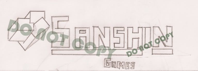
The scanned sketch:
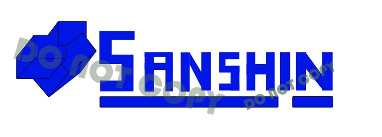
Main Logo:
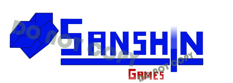
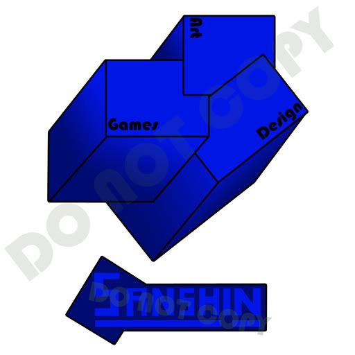
Games Logo(Section of the site):
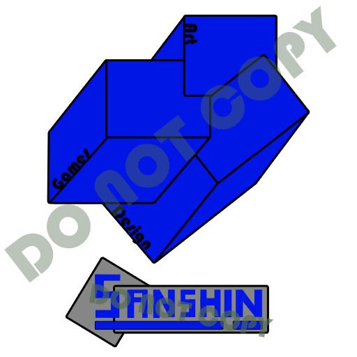
Square Shaped Logo:
All of them are vector, so that's fine (I can scale them). I wondered if I should add shading. Any comments on the colors too would be greatly appreciated.
Moderator: PC Supremacists


I realized the moment I fell into the fissure that the book would not be destroyed as I had planned.


Innerscope wrote:I agree with Marauder and Netwatcher on the perspective issue. I think the logo needs to be more defined by either shading the cubes or giving it a more distinct shape. I like that you're creating the letters, but I think they should be more evenly spaced and sized. (both the "N"'s are different sizes)
Here's a crappy mockup I did: (note: I'm using skia for the type and I rendered the cubes in a 3D modeling program)
I don't really like the way I did my cubes, but you can see that the shading helps the aesthetics of the image.
[Edit: I just saw OrinCreed's design, I think I like the flat squares better. The "I" bisecting the line is also nice.]

Yea, that's looking good.OrinCreed wrote:
Im going with all the cubes, have taken away some outlines tho...RyanPridgeon wrote:I like the blue and gray logo, but I dont like the cubes idea, or the thick black outlines everywhere.
I tried fixing that, look at the update below.Netwatcher wrote:The lowest and left cubes seems to be expanding to the distance O_O like a trapezoid.
Thanks! You're certainly an expert compared to me, I looked at some of the coloring advices and tried to improve it.OrinCreed wrote:Ok I'm no expert with logo design but I thought I might give you a critique. Feel free to tell me off.
[...]
Another thing you might want to reconsider is the blue text on the gray field. When I was in school my graphics design and web design teachers would rip someone a new asshole for doing this. The reason being is that the Blue and gray begin to bleed together, more so as the text shrinks, making it difficult to read. You could always give the text a black stroke if you are set on the color choice though. It will help break the colors apart.
[...]
Ok so here is something I tossed together using my limited experience doing logo work. I took all the ideas i liked from you logo and tried to apply some of my own suggestions. I used a generic font for the example but you could always toss in your font style. Feel free to use any or all of the ideas, or just ignore me.Hope I was a little helpful.
I'll look at it, but then I kinda want the letters to look home-made(and un-proffesional).Innerscope wrote:I like that you're creating the letters, but I think they should be more evenly spaced and sized. (both the "N"'s are different sizes)

I kinda agree myself, but Im not working on the website for now, so I havent done anything with these logos.cal3 wrote:To tell you the truth, I don't like that gradient, it looks cheap as if you just filled it with a click, choose some nice blues from a palette, I'm sure it would look better
 (
( )
)